Poster of the Week- The Exorcist (1974)

Poster of the Week- The Exorcist (1974)

William Friedkin tells a great story in his autobiography about Warner Bros’ marketing department and how they wanted to market The Exorcist on it’s completion. The idea they came up with was a drawing of Regan’s bloodied hand holding a crucifix (referencing the infamous masturbation scene) with the tagline ‘For God’s sake, somebody help her!’

For obvious reasons he declined this idea. Instead he spoke to them about the Magritte painting The Empire of Light and how he wanted the poster for The Exorcist to be inspired by that.

TheEmpireOfLight

From this came the iconic poster for his movie. The mystery of Max Von Sydow’s character outside Chris McNeill’s house with light poring out of the window but whilst cloaked in darkness. A poster that is perfect for a masterpiece like The Exorcist. And the general public agreed with the film breaking records faster than cinema ushers could break open smelling salts for patrons who had staggered into the lobby to faint.

TheExorcistQuadPoster

A friend of mine went to see the film on it’s first run and said that members of St John’s Ambulance were waiting in the cinema for the inevitable fainters and/or vomiters. Now that’s style.

And whilst we’re at it I’m loving the visual blitz of this UK Exorcist double bill poster. The hot pink is everything.

81DV5RVtGbL._AC_SL1500_

Advertisement

Poster of the Week- The Beast in the Cellar (1970)

Poster of the Week- The Beast in the Cellar (1970)

This week’s Poster of the Week is for the 1970 Beryl Reid shocker The Beast in the Cellar. Ms Reid deserves an article regarding her stellar output all of it’s own and one day that will happen.

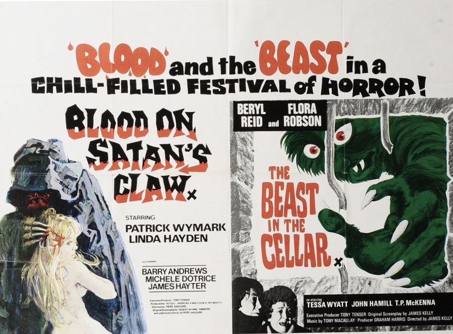
This movie was actually released not just on it’s own in the UK but also as a double bill with the equally great Blood on Satan’s Claw and this is the quad that has grabbed my attention.

BeastBloodDoubleBillQuad

Check out the almost goofy caricature of the monster used on this poster. The beast in the actual film was neither goofy or cartoonesque in the movie and so maybe this device was used so that he could take centre stage on the film’s poster without causing too much controversy for being too scary.

Whilst you’re perusing this gorgeous piece of art here’s the equally impressive Australian daybill and the UK quad poster for the film’s release on it’s own. I’m loving Beryl’s shocked expression on both.

BeastDaybill
The Australian daybill…
BeastInTheCellarQuad
…and the UK quad poster

Poster of the Week- Westworld (1973)

Poster of the Week- Westworld (1973)

This weeks Poster of the Week goes to the classic sci-fi nightmare that is Westworld from 1973.

nr008436-12_1

There are so many brilliant images here that sum up the movie- the iconic image of Brynner’s demented robot gunslinger, the technician sat in front of a bank of monitors and control panels, the technological font used for the film’s title, the tagline that has indeed gone worng…

And whilst we’re at it, take a look at the similarly brilliant posters for the film’s sequel Futureworld, (loving this tagline too) and Westworld’s Japanese and Belgian posters. All gorgeous.

IMG_3092
Possibly the most colourful movie poster ever made. And possibly the best tagline ever too.

westworld-japanese-b3-1
A similarly iconic image used for the Japanese poster

productimage-picture-westworld-5-74105
The pop art genius of the Belgian poster. Green skin is always cool.

Poster of the Week- Taxi Driver (1976)

Poster of the Week- Taxi Driver (1976)

I was 14 and the exact right age to watch Taxi Driver for the first time. The perfect movie about alienation being watched by a moody teenager who felt completely alienated.

I would regularly venture from my hometown of York to the bustling neighbouring city of Leeds and it was on my next excursion after seeing Taxi Driver that I sought out the UK quad poster in a film memorabilia shop called Movie Boulevard (unfortunately long gone). The perfect movie (it’s still my favourite film to this day followed by John Carpenter’s Halloween and John Waters’ Female Trouble) had to have the perfect poster. And it did.

TaxiDriverQuadPoster

Lead character Travis Bickle walking down a New York street, completely alone in one of the biggest and busiest cities in the world. The tagline ‘On every street in every city there’s a nobody who dreams of being a somebody’ is one of the poignant and apt in film history.

It’s strange how a film and it’s iconography can take on a life of it’s own. The ‘You talkin’ to me?’ line is one of the most quoted amongst cineastes and the general public alike but is also misunderstood and misinterpreted when taken out of context. Stills from Taxi Driver have also been taken out of context and made into posters to be hung on teenager’s walls. Strangely they seem to dwell solely on Travis holding guns which is alarming. I’m glad the studio made UK quad emphasised the loneliness aspect rather than the macho/firearms angle.

Top 10 Fan Made Movie Posters

Top 10 Fan Made Movie Posters

On my search for movie posters on the internet for my articles I come across a massive amount of fan made movie posters. Correction- I come across a massive amount of really good fan made movie posters. Heres a collection of the best I’ve seen so far (this could change as I stumble across more…)

And so, in ascending order…

No. 10- Captain America: The First Avenger

Print

Such a classic American hero gets a classical poster concept.

The Art Deco framing and reimagining for Cap works brilliantly well here as the lines synonymous with this genre also emphasise movement, action and speed.

The red, white and blue of Cap’s costume works really well against the monotone of the background’s gun metal grey.

No. 9- Friday the 13th Part 3

F13thPart3FanPoster

How do you even think about reimagining a horror villain as well known as Jason Voorhees? Like this. Take only single colours (the blue background, the green of Jason, the red lettering that looks it has been written in blood- very Manson Family) and make the image as iconic as possible to reflect the film and central figure.

This is further demonstrated when you realise that it was this Friday instalment that introduced Jason’s hockey mask to proceedings (R.I.P. Shelley). This image further emphasises the iconic dimension to this.

The red and green also remind me of the red and green stripes of Jason’s sparring partner, Freddy Krueger. A nice touch. Red and green are also the colours used for 3D- which this film was shot in. Another nice touch.

No. 8- The King of Comedy

KingOfComedyFanPoster

Sometimes simple is best. This poster is minimalism used to brilliant effect. The painting of Pupkin is gorgeous. And that’s all thats needed.

No. 7- Double-Bill – The Birds and Up

UpBirdsFanPoster

A fan made poster for an inspired double-bill coupled with absolutely gorgeous artwork. The colour of Up, the Gothic darkness of The Birds. The juxtaposition works beautifully.

The typography and aged look to the artwork works amazingly well also. I’d pay to go and see this double-bill anyway, but this poster would make me go and see both of these films even if I hadn’t heard of them.

No.6- Drive

DriveFanPoster

I’m loving that this artist has used Gosling’s stuntman mask and brought it to the fore for this poster. I’m also loving that he/she has referenced the iconic poster artwork and bald head motif from Dawn of the Dead resplendent with blood splatter.

I noticed the gore/slasher elements of Drive when I first saw it. It appears I wasn’t the only one. Bonus points for the weathered/vintage look to the poster.

No.5- Dr. No

DrNoFanPoster

A sign of a great fan poster- it fools you into thinking that it was possibly conceived and conceptualised at the time of the film’s release but not used by the studio.

This is what has happened here- the artist has utilised the same style of artwork used at the time, assimilated it and come up with something just as brilliant but completely original.

You can tell that the artist knows this film and the series it belongs within inside out.

No.4- Jaws

JawsFanPoster

There are so much Jaws fan posters on the internet and there are so many that are utterly brilliant.

This entry wins out as it terrifies me. Freud would have a field day with this. The enormity of the shark, the unsuspecting woman who is oblivious to her fate, the black water the shark is lurching up from. The sea could be the psyche, the shark our deepest fears that are waiting to attack and consume us whole. But that would be a Tarkovsky film and not the Spielberg classic we all know and love.

This poster still gives me shivers as I’m looking at it whilst typing this entry.

No.3- A Nightmare on Elm Street Part 2- Freddy’s Revenge

LGBTANOESPart2FanPoster

Such a simple premise that no-one else thought to do it! The gay subtext of Freddy’s Revenge is brought to life and placed centre stage on this poster. Thankfully it’s done by someone who is extremely talented and brilliantly gifted.

There was even a ‘Drag pre-show’ before this screening and a discussion about ‘queerness in the horror film’ after it.

This film has become a gay classic as well as newly reappraised by the horror community. It may not have been the sequel to the first that fans wanted but this curve-ball of a film has rightfully now been taken to horrorhound’s black little hearts.

No.2- The Shining

TheShiningFanPoster

This fan poster is stunning. All the disturbing aspects of the film, all of the disturbing scenarios of the film and the utterly disturbing transformed persona of Jack Torrence are  all upclose and personal on this artwork. And the choice of style for this poster is perfect for this with each brushstroke evoking so much.

When I marvel at this poster I think of the brilliance of artists such as Lucien Freud and Jenny Saville. Really. It’s that good!

SavilleManicsFace
‘Stare’ by Jenny Saville

No.1- The Texas Chain Saw Massacre

TCMFanPoster

Well, where do I even begin with this beauty?!

My eyes almost popped out of their sockets when I saw this for the first time. Quite possibly, one of the best movie posters (fan-made or official) I’ve ever seen. And loads to discuss.

When I saw this I instantly thought of the Disco-era of the 1970’s whereby a disco dancers moves would be collected together in one picture, the same figure side by side, showcasing the very best of their dancefloor poses.  I then remembered that was in fact a picture like this that was used to publicise Saturday Night Fever with John Travolta as Tony Monero being captured in various poses of disco brilliance.

TravoltaMoves
Five moves of Travolta, referenced in the TCM poster with five moves of Leatherface

Theres also a similar collection of poses of Juliet Mills from the horror masterpiece Beyond The Door that was used in the film and as a still.

BeyondTheDoorPoses

The colours on this TCM poster also compounded this Disco 70’s feel as well as the colours also echo the lit up coloured squares on the dancefloors of the era. This is a culture clash that has something in common- TCM came out at the same time as Disco was starting to take off and just two years before Travolta shook his groove thing and became a household name.

The rainbow colours also act as a signifier of the rainbow flag of the LGBT community. I don’t think Leatherface has ever been recognised as an icon of the trans movement even though he is biologically male but loves to apply make-up…to masks made of his victim’s skin. It’s unconfirmed where Travolta stands when it comes to all things LGBT.


Day 10- 31 Days of Halloween- Nosferatu (1922)

Day 10- 31 Days of Halloween- Nosferatu (1922)

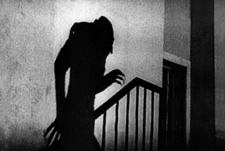
In the 80s with new horror films like The Evil Dead pushing the boundaries of the genre, television companies thought that older horror films ceased to be scary and so could be shown during the daytime. And so I saw Nosferatu which was made in 1922 one Bank Holiday morning. It couldn’t possibly frighten me, right?

It scared the shit out of me. And watching it again now it still freaks me out. An unauthorised adaptation of Dracula (the estate of Bram Stoker sued and wanted all copies of Nosferatu destroyed. Luckily this didn’t happen) this is beautifully shot and directed. In fact I could look at any frame from this movie and drool. This is an early example that a horror film didn’t have to be some kind of example of low culture but could actually be art.

Max Shreck’s Nosferatu is pitch perfect and the very embodiment of evil. This film stays in your head long after its finished with certain images being so striking and horrifying that they become seered into your psyche.

5 out of 5.

Day 6- 31 Days of Halloween- The Abominable Dr Phibes (1971)

Day 6- 31 Days of Halloween- The Abominable Dr Phibes (1971)

Vincent Price’s Dr Phibes avenges the death of his wife by bumping off the culprits with each murder having a biblical connection.

Very camp, very funny and very unsettling- this is one of Price’s best just like Witchfinder General and the Poe films he also made with Roger Corman.

the-abominable-dr-phibes-phibes-and-the-frog-mask

Check out Phibes’ clockwork band- one of the eeriest things committed to celluloid.

drphibes859_copy

Also check out the classic art deco decors and groovier surroundings that capture the early 70s so fantastically.

Caroline Munro appears but only as photos of Phibes’ tragic dead wife.

4.5 out of 5

Day 2- 31 Days of Halloween- Battle Royale (2000)

Day 2- 31 Days of Halloween- Battle Royale (2000)

A class are transported to an island and its then disclosed that they have to kill each other with the last person left standing the winner.

br-lady

Brutal (as you’d expect) but also witty, humane and strangely poignant in places. This film is brilliantly acted, directed with style and is beautiful to look. Murder and deception has never looked so good. In fact the ‘killing for sport’ theme reminded me of one of my favourite films, Turkey Shoot.

And thats all I’m going to say. To say anything more would ruin the film completely. See it.

4 out of 5

Burial Ground – Day 12 – 31 Days of Halloween

Burial Ground – Day 12 – 31 Days of Halloween

Zombies, gore and guts. Oh and spaghetti.


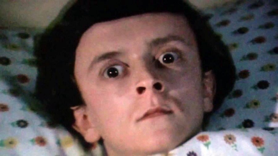
Whats noticable about this film is the incest subplot involving the effeminate manchild character called Michael played by Peter Bark. I didn’t know about this when I first watched the film. Its now seered into my mind for better or worse. This film is for titmunchers of all persuasions.
3 out of 5